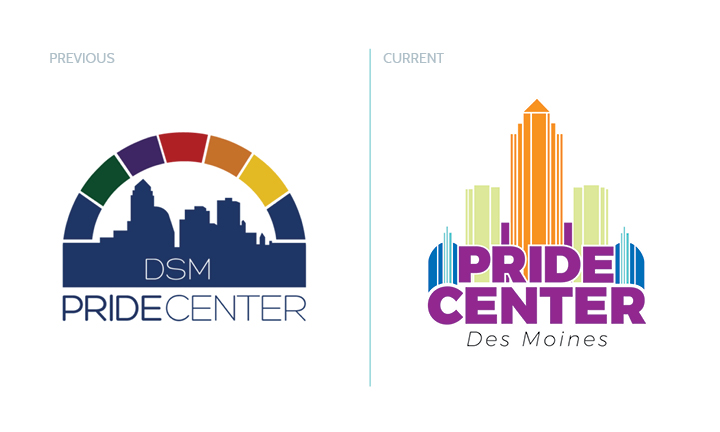
DSM PRIDE CENTER
Revised Mission
The Des Moines Pride Center is a community organization that serves, supports, and celebrates gender and sexual minorities and their allies.
Working through the branding process, we landed on accessible, friendly, and resourceful as personality characteristics.
Early sketches
The focus was to merge icons of Des Moines and the colors of the pride flag without alienating ally’s.

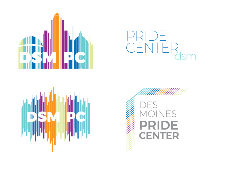
First round of ideas
All three ideas embodied the center’s revised mission — options of similar, all new, and similar/with a twist. The question that kept popping up in my mind was how to set the Pride Center apart from other LGBTQ+ organizations by creating a spectrum of color without it being a cliche of the actual pride flag colors.
Second round of ideas
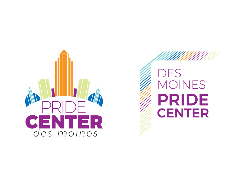
Narrowing it down to two options and working with form, color, white space and typography helped to establish a hierarchy of information in the marks.
Color iterations + final version
Working closely with The Des Moines Pride Center through the final edits created ownership and buy-in for the new identity.
The 5 vivid colors helped to express the new energy and direction of the Pride Center.
